Asset Valuation Dashboard
From DolceraWiki
Sample Dashboard
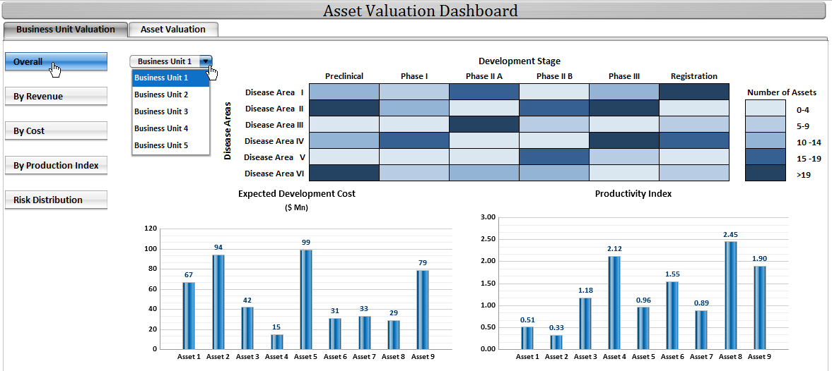
- The sample dashboard contains various options to view the data - Overall data, By Revenue, By Cost, By Productivity Index and by Risk Distribution
- The sample dashboard contains Overall information which is a heat map. The Business Unit has to be selected in order to get the heat map for Development Phase vs Diseases (in that Business Unit)
- The Heat in the heat map represents the number of assets (drugs) in that Development stage for that disease
- When the user clicks on one of them, they get charts depicting the expected development cost and the productivity index for all the drugs in that development phase for that disease
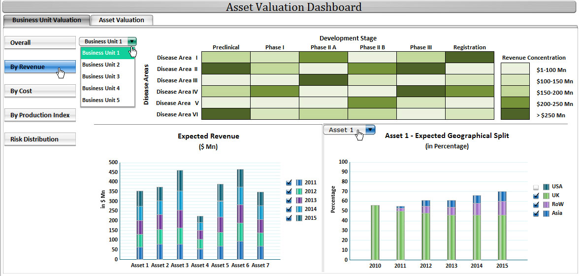
- The next dashboard depicts the heat map with the heat being Expected Revenue from that Development phase and Disease
- When the user clicks on any of them, they get the break up of expected revenue, drugwise and its geographical split
The following dashboard depicts the Revenue-wise heatmap
- Heat maps can be made similarly for other labels as well
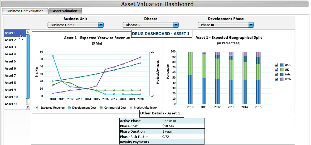
- The next dashboard depicts the valuation indicators for each asset
- To arrive at each asset, the user has to select the respective Business Unit, Development Phase and Disease
The following dashboard depicts the valuation for each asset


